Project Overview: Web Content Filters User Research
Methods and Skills: Usability testing, interviewing, wireframing
Deliverables: Research report, wireframes
Tools: Competitive analysis, Camtasia Studio, Google Docs, Affinity diagramming
Who was involved: Me, Research Assistant/Notetaker, Research participants - students and staff at the university, UM-Dearborn web team (web director, Drupal developer and technical project manager)
Opportunity
The UM-Dearborn website has an ever-increasing amount of filterable content, including news, events, and faculty and staff profiles. Users can filter this type of content by controlled vocabulary terms, like event type for events, interest area for news, and department for faculty and staff profiles.

Example of filtering interface on the UM-Dearborn College of Business faculty directory

Example of news filtering functionality on the UM-Dearborn News site
The filtering functionality was implemented as an out-of-the-box feature in Drupal, the content management system the UM-Dearborn website is built on, and had not been tested with UM-Dearborn users. After implementation, our team heard feedback from our users that it was not meeting their expectations. My goal with this research study was to determine users’ mental models for filtering web content and apply the findings to optimize the design of our filtering functionality.
RESEARCh Process
I first conducted a competitive analysis of other websites with filterable content to take stock of how their filters functioned, noting common patterns in filter logic and design. We found many sites functioned as our user community reported they expected ours to. To test our hypothesis that filters should work in a particular way, we decided to conduct usability testing. Because of time constraints and the complexity of the filtering functionality we wanted to test, instead of creating a prototype, I conducted task-based usability testing of Zappos, an ecommerce site. Similar to the UM-Dearborn website, Zappos also has a large set of content (mostly shoes and clothing) that can be filtered with terms from multiple categories (e.g., size, color, brand, price, etc.). In addition to those similarities with the UM-Dearborn site, Zappos also has the following features or patterns that we have considered utilizing on the UM-Dearborn website:
Filters that appear on the left-hand side of the content being filtered (instead of above it)
Selecting filters between two different categories results in a user seeing content that has both sets of filters applied to it (an AND condition)
Selecting filters within the same category results in a user seeing content that has at least one of the filters applied (an OR condition)
Visible filter selection and applied search terms near filtered list of content
Six people participated in usability testing of Zappos. All participants fell into key audiences of the UM-Dearborn website - current UM-Dearborn students and staff. Each of the four academic colleges and one central unit were represented by the participants. All have previously used both an ecommerce site similar to Zappos (or Zappos itself) and the UM-Dearborn website to view at least one type of filterable content - news, events, or faculty and staff profiles.
During the usability tests, participants were asked to complete five tasks that related to finding a particular type of product from a larger set. This would give them the opportunity to use the filtering functionality on the site if they chose to. Participants also were asked to think aloud as they completed each task, sharing their thoughts and detailing their interactions with the site.
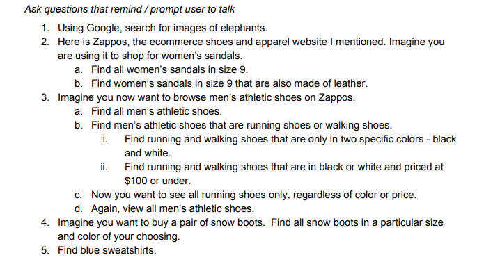
Screenshot from the research plan showing tasks users were asked to complete on zappos.com
I recorded each session using Camtasia Studio and had a research assistant take notes during the session. After all research sessions were complete, I reviewed each recording with our research assistant, looking for patterns in participant feedback by creating an affinity diagram of our notes.
Key Insights:
The AND/OR filter conditions used on Zappos matched participants’ mental models for how selecting filters between different categories and within the same category should function.
A clear indication of selected filters and an easy way to deselect those filters is important.
Users search when they have something very specific single item in mind and browse when they have something more nebulous in mind or want to see many options.
Users are unconcerned with where filters are placed on a page (e.g., to the side or above content), as long as their placement is a logical part of the workflow of filtering content.
Read my full research report, including research plan in the appendix.
I synthesized my findings into a research report for our development team, including wireframes to further illustrate my findings and recommendations.
Outcome
Recommendations
I recommended that the team implement the filter logic we found matched our users’ mental models. I worked closely with our team’s Drupal developer to define requirements and test functionality as it was developed.
Results
The logic for filtering content on our site has been updated to meet user expectations and we have implemented visual representations of selected filters to aid user memory after selecting a set of filters. Through analytics tracking, we’ve seen an increase in engagement with faculty and staff profiles after users utilize filtering functionality on the faculty directories, indicating they are more effective in helping users find what they need. We’re continuing to track news and events engagement as well.